Expandable image picker
Le
To help manage the distribution of gifts in my family at various opportunities throughout the year, I’ve been hosting for several years an instance of MyGifts, a PHP-based gift list management system.
Given how quiet Nimbustier.net had grown over the past few years, that (private) part of the site is probably one that sees most of the useful activity. So, when I looked at giving a bit of a refresh to the site while transitioning to a new static site generator system, I figured I should spend some time on improving the overall user experience of that part of the site, with a particular focus on making it more mobile-friendly.
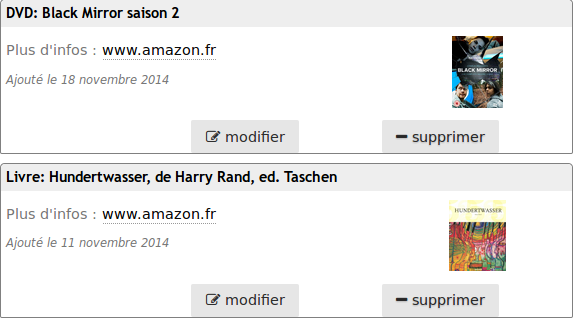
The default layout for the gift lists uses tables, which, while semantically apropriate in this case, are clearly not great for mobile, where their wide content make the page either hard to read or hard to navigate.
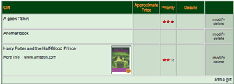
Switching that content to be linear didn’t prove particularly difficult, and indeed, is likely to prove benefitial in many other ways; among other things, it pushed me towards highlighting possible actions a lot more clearly.
I also looked into sorting the gifts in a more logical order than the default name sorting: now the list starts with gifts that have not been claimed yet, and are the highest priority for the list owner.
But there remained a somewhat more complex issue: to navigate to someone’s gift list, each gift list (including the default view, the gift list of the logged-in user) starts with the list of names of the users who have a gift list on the system.
As the system is being used both by my family and my in-laws, this list currently consists of around 25 names. Such a long list of names, with a lot of repetition (family names get displayed) is very hard to parse, and their default presentation as inline links is hard to operate in touch-based interactions, where your finger is usually wider than any single hit target.
It was clear for me that the best way to replace that list of names was to instead use a gallery of portraits representing each of the list owner — the human brain is after all wired much better for face recognition than name recognition. Besides, photos can make for much larger hit target, thus solving the touch-based interaction issue as well.
While getting myGifts to show these pictures required a tiny bit of creativity (since I wanted to keep modifications to the underlying code base to a minimum), it did happen reasonably quickly. But this list of 25 pictures soon created another issue: it meant that each gift list first screen was filled with this image-based picker, and pushed the content of the gift list well below the fold.
Of course, a simple option would have been to push the list picker after the gift list — but since navigating from one list to another is something that one would do quite often, this wouldn’t be a real improvement. It would also likely have been disorienting for those of my family that are used to the existing presentation.
What I did instead was to look at making this list of pictures less prominent by default, at least on small screens; and to do that, I came up with the following widget:
When you press the expand button, the list of pictures (whose content is alluded to by “compressing” it in a list of superposed pictures) expands to show its full content, will a small bouncing effect; it collapses back when pressing it again.
All of this is achieved purely with CSS, which I find quite satisfying, and made it easy to apply to only the small-screen version via Media Queries.